

Banner Letter Size: An Easy Chart for 10 to 300 Feet

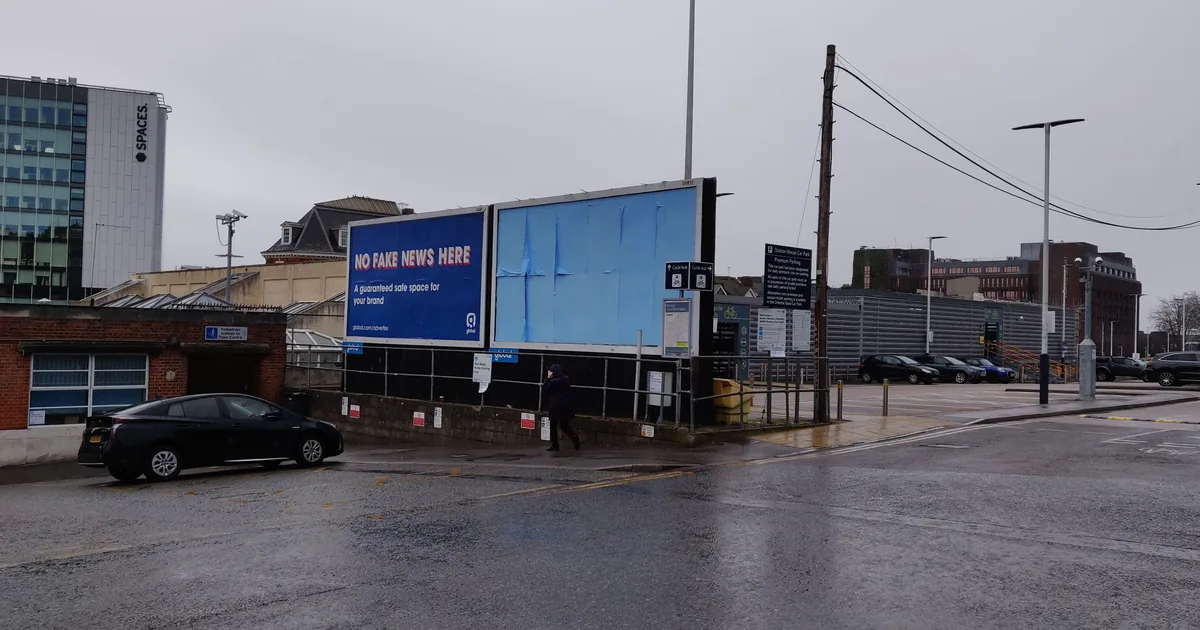
To choose a banner letter size, start with viewing distance, then adjust for traffic, lighting, contrast and viewing angle. A sign industry guideline uses about 1 inch of letter height for every 30 feet of distance as its average [1]. By that rule, text read from 60 feet away starts at about 2-inch letters. If your banner faces a busy street, go bigger.
Below is the rule and a chart you can use today. After that come the other things that decide whether a banner gets read: word count, empty space, letter style and color.
Table of Contents
Where the 30-feet-per-inch rule comes from
The United States Sign Council (USSC) is a sign industry group that funds research on how people read signs. Its guideline uses a “legibility index”. It is simply the number of feet of reading distance you get for each inch of letter height [1]. For general planning, the USSC gives an average index of 30 [1].
Highway signs use a similar number. The federal guide for road signs, called the MUTCD, estimates reading distance at 30 feet per inch of letter height [2]. It assumes a driver with 20/40 vision [2].
The Federal Highway Administration also tested one electronic message sign with six people standing still. Those with about 20/20 vision read its letters from roughly 40 feet per inch [2]. That was a small test of an LED display, not printed banners, so treat it as background, not a promise for every reader.
Banner letter size chart
To find your banner letter size, divide the reading distance in feet by the index [1]. The answer is the letter height in inches. With upper and lower case text, that height is for the capital letters [1]. The small letters will be shorter.

The chart uses three index values from the USSC guideline [1]. 30 is the guideline’s average. It drops to 25 for moderately busy streets and to 20 for very busy ones. Every number is rounded up to one decimal.
| Reading distance | Average (30 ft per inch) | Moderately busy street (25) | Very busy street (20) |
|---|---|---|---|
| 10 feet | 0.4 inch | 0.4 inch | 0.5 inch |
| 25 feet | 0.9 inch | 1 inch | 1.3 inches |
| 50 feet | 1.7 inches | 2 inches | 2.5 inches |
| 100 feet | 3.4 inches | 4 inches | 5 inches |
| 200 feet | 6.7 inches | 8 inches | 10 inches |
| 300 feet | 10 inches | 12 inches | 15 inches |
Treat these heights as calculated starting points, not guaranteed minimum readable sizes. They are for your main message. Small lines, such as a website or a phone number, will be read from closer up.
One tip when you design: measure the actual printed capital-letter height, not the font’s point size. Two fonts at the same point size can print with very different capital heights.
Why busy streets need a bigger banner letter size
On real streets, drivers read signs from at least 35% closer, on average, than on a test track [1]. In the busiest settings, readers needed letters as large as 1 inch for every 7 feet [1].
That is why the guideline lowers the index in busy areas. A moderately busy area usually has some of these: stop-and-go traffic, traffic lights, on-street parking and closely spaced shops [1]. Speeds there are under 40 miles per hour [1]. A very busy area has heavier foot and car traffic and speeds under 30 miles per hour [1].
All caps change your banner letter size
Writing in all capital letters feels louder, but it reads slower. All-caps text needs letters about 15% taller to be read from the same distance as upper and lower case [1].
For example, a message in upper and lower case that needs 4-inch capitals would need about 4.6-inch letters in all caps. For most banners, mixed case with a strong capital at the start of each line is easier to read.
Fewer words, read faster
Big letters get your message seen. A short message gets it read before the reader passes by.
Research used in the guideline shows that a sign with 4 to 8 words in simple letters can be read in about 4 seconds [1]. That works out to about half a second per word [1].
Now think about a driver going 40 miles per hour. The guideline’s worked example puts that at about 59 feet each second [1]. An 8-word banner would need around 4 seconds, which is roughly 235 feet of road.
That covers reading time alone. The USSC method adds time for the driver to notice the sign first, and to look back at the road and react afterward [1]. So the real distance is longer.
For banners seen from cars, aim for one short message: your name, what you sell, and one action. Put the rest on your website. People on foot, at a trade show or a market, can take a few more words, but the same rule helps them too.
Leave empty space around the words
Crowded banners are hard to read even with big letters. The guideline sets a minimum for “negative space”, meaning the open area around your text and graphics. It shows text and graphics taking up about 40% of the sign panel, with the other 60% left open [1].
A quick way to apply it: when your layout is done, picture a box around each block of text and each logo. If those boxes fill more than about 40% of the banner, cut words or shrink the extras, not the main message.
Letter style and color
Plain letters are easiest to read. The research tested two common letter styles [1]. One was a plain sans-serif, meaning letters without small feet, like Helvetica. The other was a serif style with small feet, like Clarendon.
The guideline also notes that cursive or decorative letters take longer to read [1]. Save script fonts for small accents.
Color and lighting change the numbers too. The full USSC tables give different index values for different letter colors, background colors and lighting [1]. So pick a letter color that stands apart from the background, such as dark on light or light on dark.
If your banner will be read at night or in a dim exhibit hall, think about lighting. Our retractable banner stand has an optional LED light.
Putting it together: three examples
- Fence banner on a busy road, read from 200 feet: use the busy-street column. That gives a banner letter size of about 10 inches. Keep it to 5 or 6 words.
- Storefront banner read from across a parking lot, about 100 feet: about 4 inches in a moderately busy area. Name, offer and website, with lots of open space.
- Trade show banner stand read from the aisle, about 25 feet: about 1 inch is the minimum, but people browse from farther away. Make the headline much larger so it carries across the hall.
You can use the chart as a starting point for sidewalk signs too. For custom flags, go bigger than the chart. Flags move, fold and curve in the wind, so part of the text is often hidden or at an angle.

Test your banner letter size before you print
You can check your layout at home with a simple scale test. Print the design on paper at one tenth of its real size. A 10-foot banner becomes 12 inches wide. Then stand at one tenth of the real reading distance. For a banner meant to be read from 100 feet, stand 10 feet back.
Everything shrinks by the same amount, so this checks your layout and how big the letters look from that distance. If you have to squint, make the letters bigger or cut words. It cannot copy traffic, motion, glare, the banner material or the real lighting where it will hang. Treat a pass as a good sign, not proof.
Limits of the rule
The 30-feet-per-inch rule is an average. Its authors warn that an average “may fall short of meeting the legibility needs of any specific sign or environment” [1]. Glare, rain, low light, a bad viewing angle and older eyes all cut reading distance. When in doubt, pick a bigger banner letter size: go one row down the chart, or one column to the right.
How we can help
We print custom banners in vinyl, mesh and fabric, plus banner stands, flags and signs. Not sure your layout will read from the street? Our design team can set the banner letter size and layout for you. You can check a preview image, called a mockup, before anything is final.
Frequently asked questions
What banner letter size works at a trade show?
Work out how far down the aisle you want to be read, not just the aisle width. For a headline meant for people 50 feet away, start at about 1.7-inch letters and go up from there [1].
Is the rule different for people walking and people driving?
The math is the same: distance divided by the index. What changes is the setting. Drivers in busy traffic have less attention to spare, so the USSC lowers the index for busy areas [1]. People on foot have more time, so they can read a few more words.
Should I use all capital letters on my banner?
Usually not. Because all caps need bigger letters to read as well [1], mixed case lets you fit the same message in less space. Keep all caps for one or two short words.
How many words should a banner have?
For banners read from cars, aim for 4 to 8 words or fewer. Research used by the USSC shows 4 to 8 simple words take about 4 seconds to read [1]. A driver may not give you longer.
Sources
- Best Practice Standards for On-Premise Signs, by Andrew Bertucci, USSC Foundation (© 2015): legibility index, average of 30, busy-area adjustments, all caps, reading time, negative space
- Chapter 3. Legibility Testing, Federal Highway Administration (publication 15-027): MUTCD 30 feet per inch, 20/40 vision, about 40 feet per inch for 20/20 vision
