

Trade Show Backdrop Design: 7 Easy Rules for Your Backwall

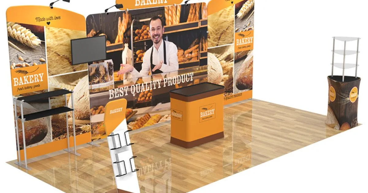
Good trade show backdrop design needs your logo and one short headline that says what you do, plus one strong image if it helps. Place the logo and headline as high as the template allows, since tables and people cover the lower wall [4][2]. Save the details for handouts.
The rest of this guide shows where each part goes, how big the text must be, and what changes on a backlit wall.
Table of Contents
Rule 1: Check how tall your backwall can be
Before you start your trade show backdrop design, find out how much wall you are allowed. Many shows use booth guidelines in the style of the IAEE, a trade group for exhibition organizers [1]. But your exhibitor manual sets the limits for your show.
For a standard in-line booth (one side open to the aisle), the back wall is generally limited to 8 feet high [1]. That full height is allowed only in the back half of the booth. Anything in the front half must stay at 4 feet or lower [1]. A perimeter booth, which backs onto the hall’s outside wall, usually gets 12 feet [1].
These are common examples, not permission everywhere. Your own show can set different numbers, so read the exhibitor manual for your event. Then design for the real size of your display. Our Straight Tension Fabric Display, for example, is 112 inches wide and 89 inches high in the 10-foot size [5]. That fits under an 8-foot limit with a few inches to spare.
Rule 2: Say a few things, not ten
Trade show backdrop design is not brochure design. Your wall works more like a billboard. People walk past it, so it has a few seconds to tell them who you are, what you do, and why they should care.

The Expo Group is an event services company. Its advice is to keep copy to a minimum, with just a logo and tagline [2]. We would add one clear headline and a single strong image, and save long details for brochures and handouts.
So a good trade show backdrop design usually holds:
- Your logo, large and near the top.
- One headline of a few words that says what you do or who you help. Think “Payroll for Restaurants” or “Custom Cabinets in 3 Weeks”.
- One strong image, if it helps explain your offer. It might show your product or the result you deliver. Some backwalls work well with just a logo and a headline.
Things that belong somewhere else: your full service list, long paragraphs, a phone number in small print, and five small photos. A short web address can fit on the wall if you want one.
Rule 3: Put the main message as high as you can
Every trade show backdrop design has to allow for a hidden lower section. Tables, counters, monitors and staff stand in front of it all day. Monitors, cabinets and registration desks can block important information, as The Expo Group warns [2].
Our trade show artwork guidelines ask for your logo and main message in the top half of the backdrop [4]. Treat that as the lowest line, not the target. At 45 inches, text can still sit behind a standing adult. So place the main message as high as the template allows. Then check it against people, counters and equipment.
Here is a simple height plan for an 89-inch fabric graphic. Heights are measured up from the bottom edge of the graphic, not from the floor.
| Part of the wall | About how high | What to put there |
|---|---|---|
| Top band | 70 to 89 in | Logo and headline |
| Middle | 45 to 70 in | Main image, short supporting line |
| Lower half | 0 to 45 in | Background color or pattern only |
The band lines are a starting point, not a rule. If you have a product template, keep essential content clear of its edges, seams and finishing areas. Before you finish, sketch your booth from the aisle. Mark where the table, the monitor and the people will stand. Then move anything important that ends up behind them.
Rule 4: Make the text big enough to read from the aisle
Text that looks fine on a laptop can disappear on the show floor. Size the words for the aisle, not the screen.
The United States Sign Council is a sign industry group. Its common rule uses about 1 inch of capital letter height for every 30 feet of distance [3]. Divide the distance in feet by 30 to get a starting letter height in inches [3].
| Reading distance | Calculated starting letter height (capitals) |
|---|---|
| 10 feet | 0.4 inch |
| 20 feet | 0.7 inch |
| 30 feet | 1 inch |
| 60 feet | 2 inches |
These are calculated starting points, not a promise that people can read the text. The rule was built for signs, and a crowded hall adds people, glare and distractions. A headline that has to grab attention across the hall should be much bigger.
Two more checks help. Use upper and lower case for most words, because text in all capitals needs letters about 15% taller to read from the same distance [3]. Then test it. Print a section of your text at full size and step back 10 to 15 feet [2]. Can you read it?
Rule 5: Pick colors with strong contrast
In a busy hall, trade show backdrop design needs colors that stand apart. Bold colors can draw the eye, and strong contrast between text and background makes the words easier to read [3].
Keep the area behind any text plain. The Expo Group’s guide suggests avoiding multi-color gradients (colors that fade into each other), busy shapes and lines behind your words [2].
Check your logo against the background, too. According to that same guide, on white, a full-color logo works [2]. On a dark or multicolored background, a one-color version in a contrasting color usually reads better [2]. Most brands already have these versions, so ask whoever made your logo.
Rule 6: Plan for a backlit wall before you design it
A backlit display has LED lights inside the frame. They shine through the printed fabric, so the colors glow [4]. Our SEG displays include backlit models, and the backlit look stands out in dim exhibit halls [4].
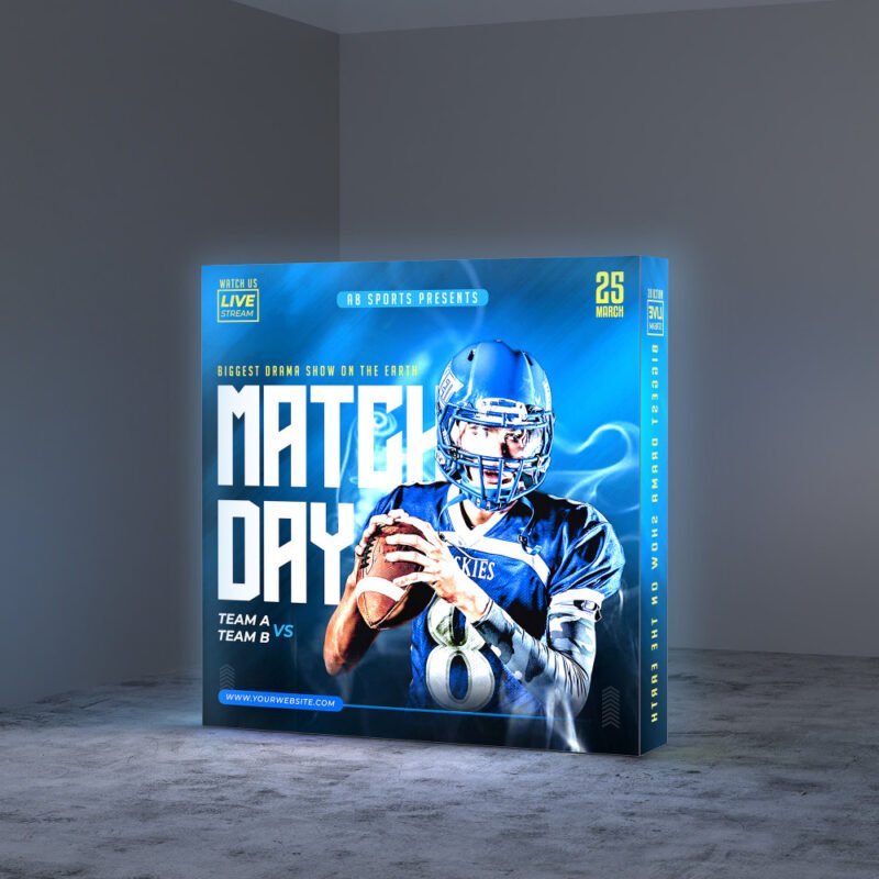
Backlighting changes how printed colors appear. A color that looks right on your screen, or on an unlit print, can look different when light shines through it.
Do not assume an exact match on a lit wall. So if a brand color matters, ask us about color expectations before you order. Ask, too, whether a physical sample can be checked on the lit display you plan to use.
One more detail: on our single-sided backlit displays, a blackout fabric comes with the display to cover the back [4].
Rule 7: Set up the file so it prints sharp
A great trade show backdrop design still fails if the file is wrong. Our Help Center has the full file rules. The short version for trade show graphics [4][6]:
- Send a JPG or a single-page PDF in CMYK color. CMYK is the set of four ink colors printers use.
- Make it at least 150 dpi at the final size. Dpi means dots per inch, a measure of how sharp a print is.
- Make the file the exact size of your display order. Leave off crop marks and bleed (extra edge area).
- If we supply a template, use the template dimensions when they differ from the display size, and do not scale the template [6].
- Turn fonts into outlines (shapes) and change spot colors, such as Pantone colors, into CMYK.
- For tension fabric displays, use the design template for your size. Ask us and we will send it.
- Flatten the artwork and make sure all images are embedded, not linked [6].
- Delete the template guides and any hidden layers, so nothing prints that should not [6].
- Keep the upload file under 100 MB [6].
Your logo should be a vector file, which is made of lines and curves and can scale to any size without getting blurry [2]. A photo is different. It is made of pixels, and it gets fuzzy if you blow it up too far [2]. A small image saved from a website will not hold up on an 8-foot wall [2].
Mistakes that weaken trade show backdrop design
Most weak backwalls fail in the same few ways:
- Too much text. Long paragraphs tend to get skipped, and crowded graphics are hard to take in.
- The logo is too low. It ends up behind the table or the person standing at it [2].
- Low-resolution photos. A web image stretched to wall size looks blurry.
- Fine detail on a busy background. Thin fonts and patterns behind text are hard to read from a distance [2].
- Dates and prices on the wall. They tie the graphic to one event. Keep them on signs or handouts you can swap.
That last one saves money. Many of our booth kits have a graphics-only option, so you can keep the frame and order a fresh design for future shows [4]. A trade show backdrop design that stays general can travel to many shows before you replace it.
How we can help
You can see our backwalls, fabric displays and full booth kits on our trade show displays page. Prices are online, and you can upload artwork in a few clicks.
No artwork yet? Our team can design your booth graphics through our graphic design services, with a mockup for you to check before anything is printed. Design and mockups start from $75. If you have a question about your show’s rules or your file, contact our Atlanta team.
Frequently asked questions
What should go on a trade show backdrop?
Your logo and one short headline that says what you do, plus one strong image if it helps explain your offer. One event services company recommends little more than a logo and tagline [2]. Put details such as your service list and contact information on handouts.
How high should the logo be on a trade show backwall?
At least in the upper half of the wall [4], and as high as the template allows. On an 89-inch graphic, the halfway line is about 45 inches up, which a standing adult can still block. Check the final spot against the people, counters and equipment that will stand in front.
How tall is a standard trade show backwall?
Under the IAEE booth guidelines, an in-line booth’s back wall is generally capped at 8 feet, and a perimeter booth’s at 12 feet [1]. Those are common examples. Your exhibitor manual sets the real limits, so check it.
Does trade show backdrop design change for a backlit display?
Yes. Light shining through the fabric changes how colors look. If a brand color matters, ask about color expectations and whether a sample can be checked on the lit display.
Sources
- Booth Guidelines, International Association of Exhibitions and Events (IAEE), © 2019, as published for a 2026 show (am2026.perio.org): 8 ft linear back wall, rear-half rule, 4 ft front limit, 12 ft perimeter booths
- Graphic Requirements and Design/Layout Recommendations, The Expo Group (2025): minimal copy, logos and taglines, placement away from monitors and desks, 10 to 15 ft test, plain backgrounds, logo versions, vector vs raster
- Best Practice Standards for On-Premise Signs, by Andrew Bertucci, USSC Foundation (© 2015): legibility index average of 30, all caps 15% taller
- Trade Show Displays and Artwork Guidelines, 15X Prints: upper-half placement, file rules, templates, backlit displays, graphics-only option
- Straight Tension Fabric Display, 15X Prints: display sizes (10 ft: 112 x 89 in, checked 2026-10-30)
- Help Center, 15X Prints: template size, flattening, embedded objects, removing guides and hidden layers, under 100 MB
